Euro budget airline UX dark patterns showdown 2026

What is up? It’s hot over here.

I have had the pleasure of flying with three European budget airlines this summer.

A few weeks ago, I wrote about the Ryanair check-in experience. It was exactly the dark pattern UX hellscape that I dreamed of – a true education and delight.

I’ve now also flown with easyJet and Wizz Air (named after the cheese?) and so I am able to impartially and scientifically present a head-to-head-to-head showdown: who has the worst and most misleading UX?

Ryanair

It’s Ryanair. Ryanair are the worst. Maybe the article would be “better” if I saved the reveal for the end, but, whatever, like there could be any other victor.

Ryanair gets 10 / 10 golden harps for a long, confusing and actively misleading check-in flow. Can the others even get close?

Wizz Air

A disappointingly non-confrontational experience, where you just say no, I don’t want that, and the site just kind of agrees and goes along with it? And then some stuff about who are you, no explosives, thank you, I’ve already eaten, and that’s it.

Wizz Air gets an initial 2 / 10 golden harps for the standard-issue presence of random seat and insurance/hotel/car up-sell features.

They are awarded an additional bonus 2 golden harps, a grand total of 4 / 10 golden harps, for this shocking date selection widget. It’s shown here picking dates for a flight but they use the same one for your date of birth. See how it is impossible to type in a date, and it’s very difficult to discover how to change year without scrolling month-by-month, potentially for decades…

Interlude: the curse of the apostrophe

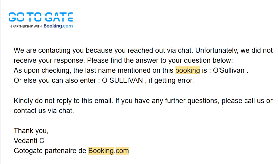
Anyone with an apostrophe in their name – or names that otherwise do not conform to narrow cultural expectations or that break bad/legacy code/integrations – will understand this.

I booked these trips through booking.com. Overall, a good experience, except I couldn’t get Wizz to recognise my name. I tried to resolve this via both Booking.com and Wizz Air support, and in fairness both did respond quickly with the information I needed, which was to use one of the usual fallbacks of O space SULLIVAN. I did however have to lie to a phone menu to talk to a Wizz Air human, who was clearly evaluated on call time, and couldn’t wait to get rid of me…
EasyJet

EasyJet are similarly un-Ryanair-y and seem to have forgotten to squeeze you hard. The seat / bag stuff isn’t particularly alarmist, with only a small amount of “are you sure?”. There is one interstitial about like buying a sandwich, and the up-sell items are easy to overlook and actually come after check-in is complete.

Both Wizz Air and EasyJet also provide a good-ole PDF boarding pass, which worked fine on my phone without an airline app, unlike Ryanair who have removed this option.

3 / 10 golden harps. Do they actually recognise their customer as a sentient being, deserving of respect, or something? Must try harder.

On check-in strategy

As mentioned last time, I generally try to check-in with “random” seat allocation immediately before the flight, the logic being that if they’ve already given away the “bad” seats they’ll be forced to give you a “good” one.

This time round, I wasn’t able to check-in at the last moment, but in both cases it was on the day of the flight. Wizz did what you expect and gave me a middle seat near the back, boo hoo. EasyJet, on the other hand, gave me an aisle seat in the exit row – one of the best and most expensive seats on the plane.

Of course, if you pay for a middling known-quantity seat, your chance of getting a top one is exactly zero. You can’t win if you don’t play.
Cliches in the age of the LLM

I now spend many hours a day reading LLM generated text. Summaries of systems and interactions, guesses at what caused a bug, implementation plans, pull requests descriptions. Pages and pages of flabby prose, which I skim, and then offer a pointed response, increasingly impatient. “NO don’t cast just use the type”, “why is this needed? seems pointless”, “KEEP IT SIMPLE”.

My productivity has never been higher. I can accomplish things that I would have never attempted before. The foundations can feel insubstantial – like sand moving under my feet – as I resist being led down a mistaken path, as I challenge strange and confident presumptions. But there is no doubt this new, alien tool is powerful, and I enjoy my work as much as ever, maybe more.

Yet something has been gnawing at me for a while. I think it’s all the cliches. I resent having to read this bilge in order to do my job.

You’ve always been exposed to cliches when working in business and tech. Management is famous for its jargon (I will loop back on this) and the software world has its argot of happy paths and yak shaving. But there was an essential limit to the volume that could be produced: an actual person had to spend a moment of their life opening their mouth or tapping at a keyboard. It already felt like a lot, and now there is more.

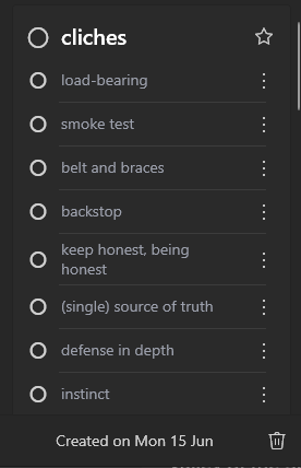
Since I had this realisation – these cliches are killing me – I started to note them down. Somehow this made me feel better. I shared my quest with colleagues and maybe it helped them too: “I would have said hidden before but I think it’s made me say opaque”.

I’ve apparently been collecting LLM cliches since 15 June, mostly from Claude, although ChatGPT seems to pull from a similar pool. They cluster into a few groups and here is my attempt at a glossary of current LLM cliches:

  • load-bearing. Anything that does anything.
  • backstop, belt and braces, defense in depth. The opposite of load-bearing, anything that does nothing.
  • smoke test, smoking gun. Evidence for something. Both smoke related, I now realise. 
  • keep honest, being honest, honest caveat. These possibly leak from prompt/training attempts to control confabulation?
  • hand-waving. The opposite of being honest, making shit up.
  • instinct, your read, called me out, this flips my lean, reframe, gets to the heart. What the bot says when I apply my professional experience to a problem. I take “instinct” unreasonably personally – lucky guess, meat bag. Read and lean as nouns is annoying.
  • (single) source of truth, canonical. A parting gift from the Jira-cleric class as they drift into the good night.
  • north star. A direction (specifically: north).
  • one wrinkle. A catastrophic problem.
  • in-flight, mechanical, fast follow, big lift, blast radius. Words for doing stuff.
This became a bit of a problem.

Not all of these are awful but, for me, all have grown tiresome from overuse. Some are truly dreadful and “this flips my lean”* is the worst.

This post is largely therapy: “these are my cliches, what are yours?”.

But perhaps the concept of the cliche opens up a deeper point about how LLMs invisibly diminish the breadth of our ideas. The endless repetition of the cliche certainly grates and reduces our own vocabulary (you are what you eat). More generally, though, I believe that the way that LLMs present us with language that emulates finished thought in turn restricts the range of ideas that we even explore.

The “blank sheet of paper” problem is no more. We no longer have to confront an empty document or code window and make something from nothing, in fits and starts, as we think through the puzzle and build up an answer in our minds, inchoate and incoherent at first, slowly solidified by small revelations.

Instead, we offer a vague prompt and get pages of instant babble in return, ending with something like “should I just apply fixes 1-3 or tackle the wider refactor now?”, like these are the only possibilities in the universe. 

* my wife made a comment about what this rhymes with which is unpublishable

Just because each item makes sense doesn’t mean they make sense together

Years ago I worked somewhere which, for a couple of years, had a “staff club”. This was a room in a weird spot behind a staff canteen (also an odd place…) which I guess was otherwise dead space. So some committee somewhere decided to designate it as a club – which in practice means it had a ping-pong table.

A recently-retired person presided over the club (possibly as a sinecure?). There wasn’t much to do – it was a room with a ping-pong table – but you can’t just do nothing. So she made signs. Signs for everything. Some a little preachy, “please open the window on a hot day so any odours don’t affect other club users”. Every cupboard labeled. Administrative notices. Signs about coffee. Just a lot.

I mentioned this to her one day – “wow that’s a lot of signs!” – and her response was:

  • “For every sign you see, there is a reason it’s there”

And I thought this was kind of profound because it’s obviously true and completely wrong at the same time. In her mind, each sign had earned its place. But she was unaware, possibly because it happened over time, that together, with all of these signs, it looked like a sign shop. And any signal that might come from a really important sign – “do not open, you will die.” – is lost.

Perhaps something similar is happening at IKEA? (How’s that for a link?)

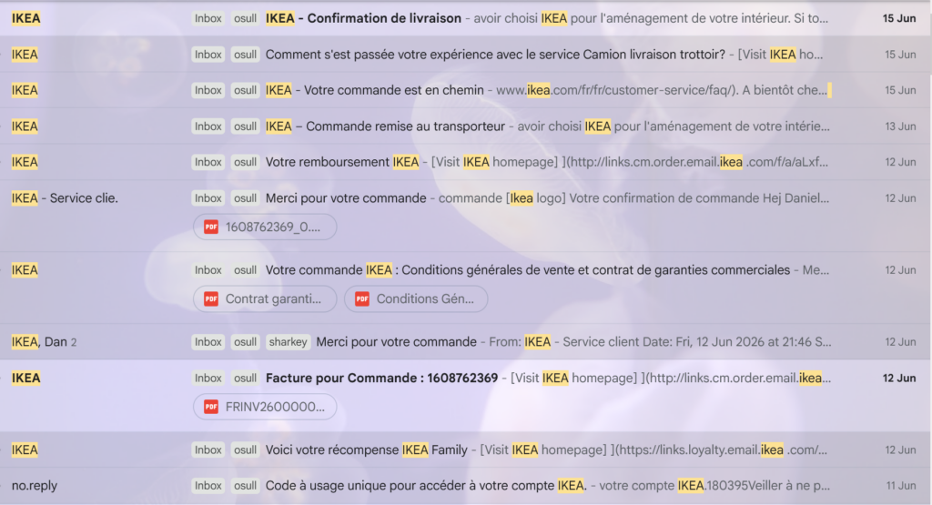
Here’s what I received for a recent purchase:

OK so it’s in French but you hopefully get the idea – this seems like a lot of emails for one transaction:

  • 1 x login security code. This is fine, we allow this. I don’t want anyone snooping on my pillow talk.
  • 1 x redemption of voucher that I had from a previous purchase. Not so bad. But it is a design decision to have this happen separately from the purchase, and the decision does have fallout.
  • 4 x order confirmation. YOU ARE CRAZY. A couple are slightly different – one is designated an invoice, one has T&Cs – but come on.
  • 3 x delivery updates. I think these are fine? People do like to see stuff moving towards them.
  • 1 x survey thing, the obligatory “how did we do?”. (Side note: are there any decent studies of the quality of data that these produce? I always ignore them and my feeling is that they give you a nice specific number, completely unrelated to reality.)

Did you spot the deliberate mistake?

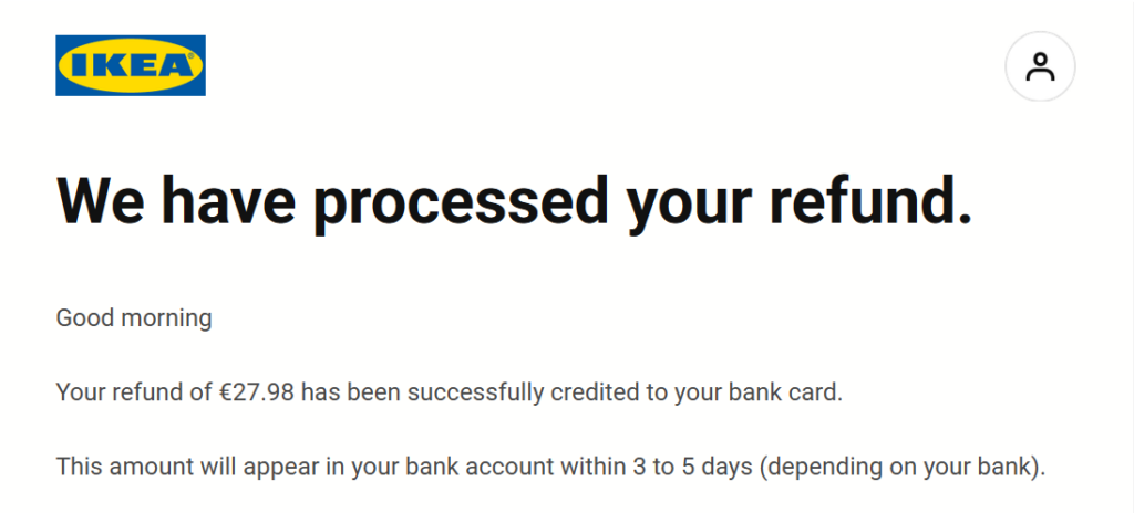
There is one more email in the list – “Votre remboursement” / “Your reimbursement” – which is about the only thing that actually happened:

I guess this explains why there was no bed sheet in the delivery?

But see that it doesn’t say anything like “sorry, we didn’t have your bed sheet”. The customer, drowning in information, is left to deduce the true meaning for themselves. It’s just another transaction email, one of eleven, which only hints at the story left untold…

Dan

Ryanair dark UX patterns summer 2026 refresher

Everyone likes dark UX patterns – such fun!

Ryanair are Europe’s most profitable airline and they are masters of this noble form.

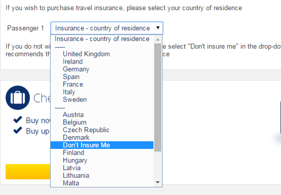
This is an all time classic from around 8 years ago – to not buy travel insurance, you must select Don’t Insure Me, midway down a list of countries:

"Don't Insure Me" listed between Denmark and Finland

I have the joy of doing some budget flying this summer and I thought I’d see how upsell-alicious the check-in process is in Trumpyear 2026:

I count 9 stages a user has to successfully navigate to avoid extra payment:

  1. “No, don’t want to be insured”
  2. Don’t be tricked into unlocking check-in for your return flight, this costs.
  3. Roll the dice by finding and selecting the random seat option.
    Do you feel lucky punk?
  4. Confirm you understand the precarious and unsettling nature of random allocation.
    Maybe you want a break from your companions?
  5. “Last chance to choose where you sit”
  6. Opt for 1 Small Bag only. A scary warning pops up about being charged at the gate.
    To be fair, I did recently see this happen to a couple at the airport. They feebly argued their case – pun intended – but I completely agreed with the airline staff. If the case don’t fit…
  7. Don’t click “Upgrade to Priority & 2 Cabin Bags”. This one is particularly sneaky as it doesn’t have a “No” option, you must dismiss the window.
  8. Scroll past security fast track and pre-paid credit, which at least just needs a “Continue”.
    The kid sitting next to me on the flight back bought some Versace aftershave and I pretended to care/be impressed because I am a nice person.
  9. Don’t rent a car, don’t buy parking, don’t buy a train(?)

Tada – you are checked in.

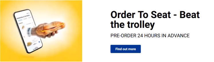
You get one final ad, I assume, for a Sam Altman fever dream in which humans EULA consent to become foie gras in exchange for tokens:

Order to Seat - Beat the trolley

I will finish with an actually sensible/possibly useful postscript.

Based on a small amount of recent experience, the best strategy for Ryanair is to check in at the last possible moment. If they’ve given away all the bad seats, they’ll be forced to give you a good one, and I got an exit aisle seat, which also gave access to the precious overhead bin.

The best strategy for Lufthansa is to check in as early as possible. They still offer to sell you a “better” seat. But you can immediately see what spot you’re assigned, and they fill up the plane from front to back in a refreshingly old-fashioned manner, so earlier is better.

Hope you enjoyed this, more soon.

Dan

Introducing Langwag, a mega interactive language learning app

Hi all,

Today I’m announcing a project that I’ve been working on for a while:

Langwag: a language learning app. It supports more than 30 languages. The idea is that you can copy and paste any news story into it to get a personalised translation and language lesson.

I’ve found this to be a satisfying way of learning since I spend a lot of time reading the news anyway. It seems to work well because it’s driven by your interests – and so it’s much more interactive than slot machine Owl-based alternatives. A friend said she understood more than expected because she already knew the “characters” (orange guy, drunk FBI guy, torso rocket guy, you know).

It has a bunch more features, inspired by what I’ve found I actually need to help me learn French while living in France: look up and practice phrases, hear things read out loud, ask questions. It also has a cute dog logo. I have ideas for improvements, but really it’s over now to you, the world: what would you like to see?

There is a hopefully pretty good demo on the public site so you can see how it works. You can add a few of your own news stories for free and, if it clicks for you, Early Adopter access is just $5 / month – less than a lactose free venti iced chai latte with lavender cold foam (a real drink that I learned about yesterday).

Dan