Years ago I worked somewhere which, for a couple of years, had a “staff club”. This was a room in a weird spot behind a staff canteen (also an odd place…) which I guess was otherwise dead space. So some committee somewhere decided to designate it as a club – which in practice means it had a ping-pong table.
A recently-retired person presided over the club (possibly as a sinecure?). There wasn’t much to do – it was a room with a ping-pong table – but you can’t just do nothing. So she made signs. Signs for everything. Some a little preachy, “please open the window on a hot day so any odours don’t affect other club users”. Every cupboard labeled. Administrative notices. Signs about coffee. Just a lot.
I mentioned this to her one day – “wow that’s a lot of signs!” – and her response was:
- “For every sign you see, there is a reason it’s there”
And I thought this was kind of profound because it’s obviously true and completely wrong at the same time. In her mind, each sign had earned its place. But she was unaware, possibly because it happened over time, that together, with all of these signs, it looked like a sign shop. And any signal that might come from a really important sign – “do not open, you will die.” – is lost.
Perhaps something similar is happening at IKEA? (How’s that for a link?)
Here’s what I received for a recent purchase:
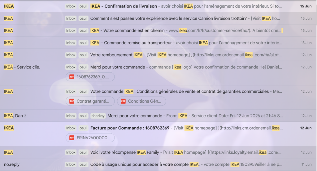
OK so it’s in French but you hopefully get the idea – this seems like a lot of emails for one transaction:
- 1 x login security code. This is fine, we allow this. I don’t want anyone snooping on my pillow talk.
- 1 x redemption of voucher that I had from a previous purchase. Not so bad. But it is a design decision to have this happen separately from the purchase, and the decision does have fallout.
- 4 x order confirmation. YOU ARE CRAZY. A couple are slightly different – one is designated an invoice, one has T&Cs – but come on.
- 3 x delivery updates. I think these are fine? People do like to see stuff moving towards them.
- 1 x survey thing, the obligatory “how did we do?”. (Side note: are there any decent studies of the quality of data that these produce? I always ignore them and my feeling is that they give you a nice specific number, completely unrelated to reality.)
Did you spot the deliberate mistake?
There is one more email in the list – “Votre remboursement” / “Your reimbursement” – which is about the only thing that actually happened:
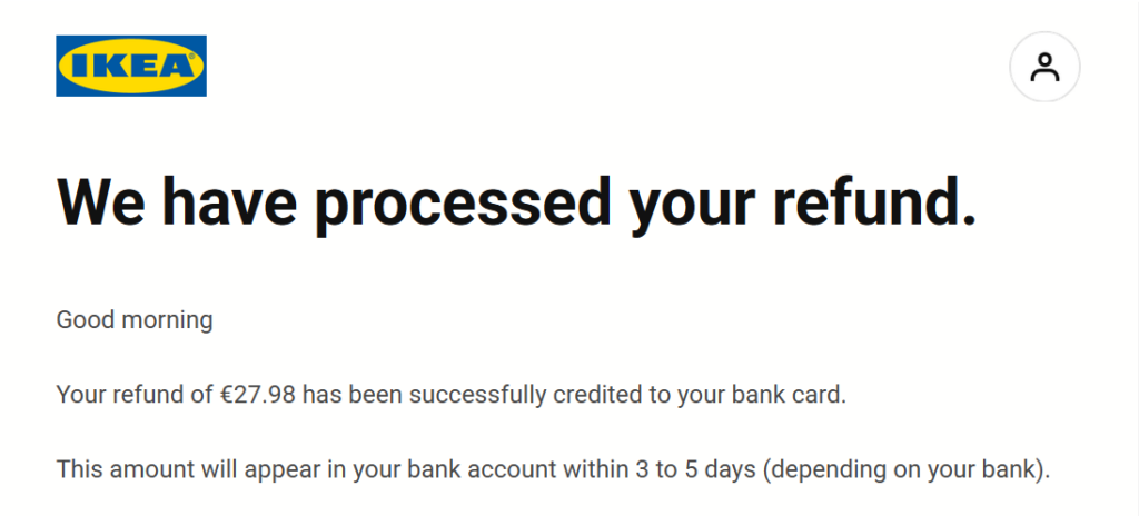
I guess this explains why there was no bed sheet in the delivery?
But see that it doesn’t say anything like “sorry, we didn’t have your bed sheet”. The customer, drowning in information, is left to deduce the true meaning for themselves. It’s just another transaction email, one of eleven, which only hints at the story left untold…
Dan